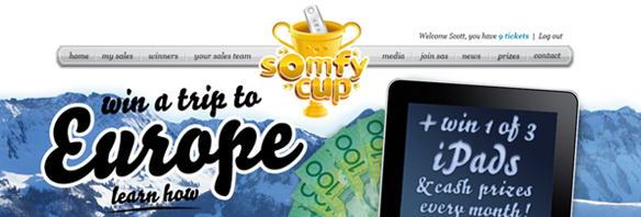
Somfy approached us to create an online trade competition. It would be driven by an extensive online portal and content management system. Sales reps would log in and register their sales to be in the running to win some—excuse my French—bloody good prizes…oh, oui oui!
THE LOGO
The logo, as often the case, was the first thing designed. We wanted something fancy, even a bit tongue-in-cheek and over-the-top. We were allowed to have some fun with this one, and—as it was going to live online—we were able to give it more la-di-da details.
Originally we suggested different levels of detail, to give it more flexibility. For the website header, we offered the version you see above, with all the bells and whistles. Then we dropped the floral embellishments, lost the remote buttons and scaled back the gradients for a simpler version, which could be used on a business card or letterhead, for example.
It’s not a bad idea to give your logo a few different “costumes” like this. This is similar to a web design concept called progressive enhancement/graceful degradation, where you build websites that take advantage of all the latest tools of modern browsers, while building simpler versions that work in the older browsers too.
THE WEBSITE
The real beauty of the website is only available to those of you who sell Somfy Automated Blinds and Shutters.
The most important thing on the site is to register sales—the more sales they register, the more tickets they get. The more tickets they get, the more chances they have at winning a trip to Europe, an iPad or a hundred bucks. We offer a simple layout to input the sale information plus a way to hide it if you want to check out the rest of the site, or you want to show an attractive work colleague that you’re now a hipster iPad user (by showing them that you’ve won!)
There is a ton of code here to work out the calculations and administration of the Somfy Cup—this is the heart of the website. All the ‘stuff’ that makes it work…kind of like the engine to a car, we don’t care how it works, just as long as it works well. So the real value of the website is also the most hidden, here is a quick squiz under the bonnet.
We make sure that the person registering is a true Somfy sales person, we check this by informing their Somfy Rep of the new registrant which can then be deleted if they are not an actual sales person. We check the sales, we then check them against a calculation to work out the tickets for each month. This is a snippet of code:
if ($motors_sold >=20) {$bonus = floor(($motors_sold/20))*5;} else {$bonus = 0;} $tickets_temp = $motors_sold-4;$number_of_tickets = $bonus + $tickets_temp;if ($number_of_tickets < 0) { $number_of_tickets = 0; }
On top of all the awesome code, we used even more code to make the site look awesome (in err… browsers that accept W3C standards (sorry IE)) with CSS3 and jQuery.
THE PRINTED STUFF
The print collateral was an after-the-fact add on. Posters, DL flyers and press ads were all designed with the sole purpose of driving reps to the website. They flowed on from the chosen website design, so consistency and recognition would be there once people had logged on. The press ad had to follow another style.


