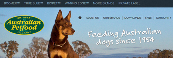
We’ve just finished a website overhaul for The Great Australian Petfood Company. The response so far has been very positive:
Well done it looks really good, we are stoked. The feedback we have been receiving is brilliant!
Scott Arnold, National Sales Manager.
The morning after launch, the first sales enquiries came in, and they’ve been pouring in ever since. It’s a testament to the effectiveness of that modest bit of web technology—the enquiry form.
Clients don’t always go to as much effort with the brief as they should. On the other hand, this one was thorough—it came in on an A1-sized mindmap:
This sort of effort at the beginning of a project can make all the difference.
The website was not only meant to sell Kibble, but also a rural and wholesome vision of Australia. Especially to overseas buyers.
No part of your branding is more important to keep fresh and updated than your website, especially with the speed at which web technologies change. A five year old website can look a decade old; it’s just the nature of the beast.
If your website is looking tired, give us a call, and then you’ll be dancing.

