A recent announcement from Google has now put mobile-friendly websites and the need for responsive web design at the forefront of any business’ online marketing strategy. Check out this infographic for more.
Responsive web design is essential to your business.
Google has made a major change to their search algorithm in order to rank mobile-friendly sites higher for searches on mobile devices. The change will help mobile device users find the information they’re looking for and enable them to easily view the content on their devices. You can read more about this here.
Is your site mobile-friendly?
To find out if your website gets Google’s tick of approval, you can run a free test to see if your website is ‘Awesome’. We’ll wait here while you check.
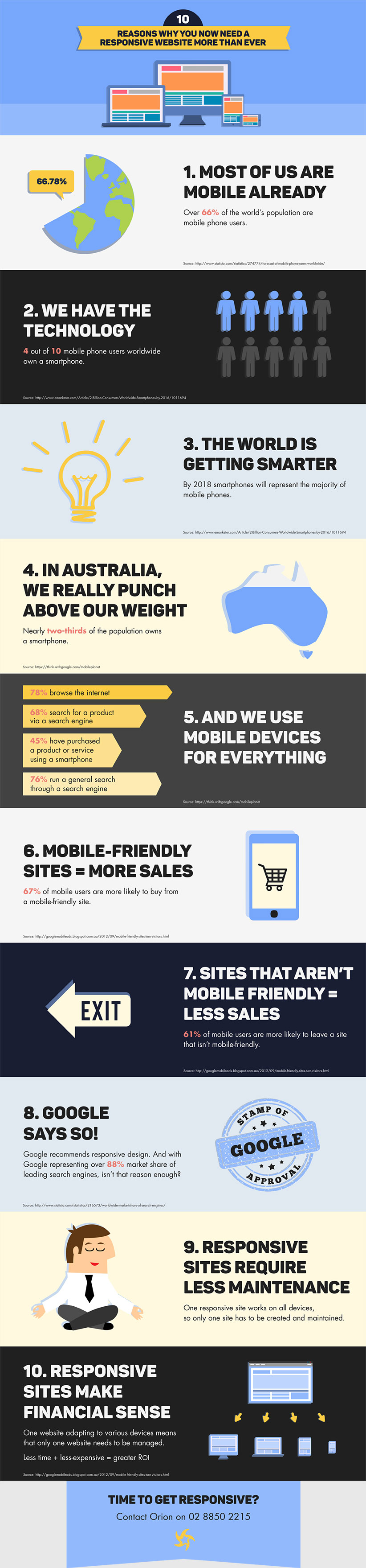
So did you pass the test? If not, it might be reason enough to get your site updated for mobile optimisation. But if you need more convincing, view the infographic below to see what potential impact mobile search rankings will have on your business and why we recommend responsive web design over a mobile version of your site.
10 reasons why you need to go responsive [infographic]

So there you have it: if you want your business to have a competitive advantage, consider contacting Orion Creative to find out more.
Time to get responsive?
Contact Orion Creative to discover how we can help.
If you’d like to keep up-to-date with our latest work and tips on social media trends, marketing and more, follow us on Facebook, Twitter or LinkedIn.
If you liked this article on responsive design, take a look at a recent example with ‘Brand refresh breathes new life into business intelligence’.