ux: the important meaning behind two letters
You’ve probably overheard some conversations between cool twenty-something-year-olds discussing the amazing ‘UX’ of a certain website or app and wondered what on earth they were talking about. Are they speaking some secret language you will never be privy to? Are they just trying to be trendy?
We can’t say for certain whether or not they were trying to be trendy – if they were sipping lattes while having the discussion, then the chances are they were – however as you’ll discover by the time you’ve finished reading this article, not only understanding UX, but also ensuring its presence and quality is absolutely crucial to the overall success of your website.
What is UX?
UX, otherwise known as user experience, is how a user experiences a product or service and how they interact with it. It incorporates aspects such as how easy things are to use, how users perceive their experience and the emotions they feel towards the business or organisation providing them.
Simply put, UX focuses on the overall user-friendliness of a customer’s journey, and your aim should be to help the customer achieve their goals in the most simple, frictionless way possible. A customer’s goals will obviously differ depending on the type of products/services your business offers, however there are important features of high-quality website UX that will always remain constant.
These include whether your information is presented clearly, how easy your site is to navigate, how well the design supports users to achieve their goals, whether everything works as it should and, if your site includes ecommerce or requires users to enter personal details, whether it feels secure.
So, now you know that secret, confusing code those hipsters were talking in isn’t actually so secretive or confusing after all, here’s why you should care about your website’s UX and the benefits you’ll experience by doing so.

Why does website UX matter?
The funny thing about UX is that the best examples of it sometimes don’t even get noticed by the user, however poor UX will stick out like a sore thumb.
Take the Facebook app for example – the navigation is simple, you can find what you’re looking for in seconds, you can view nearly all types of content without leaving the app and, by the time you know it, you’ve just spent 30 minutes mindlessly scrolling having been completely immersed in the never-ending stream of posts on your news feed.
But just because people mightn’t specifically notice good UX doesn’t mean it’s something you should ignore. High-quality website UX will help with the legwork of boosting your brand, growing your business and, even if it’s subconsciously, will encourage users to take positive steps with your organisation.
It’s just something your customers will expect
Getting potential customers to make positive online interactions is essential to any modern business, and your website is the backbone of your online presence. In today’s digital age users just expect a good website experience, and if they don’t get one with yours, they’ll find another that can provide it. If your site is poorly designed, not accessible on a range of devices, unattractive or not kept up to date, it’s likely that customers will question whether to do business with you.
It supports online purchases and conversions
Aside from providing memorable experiences, good UX plays a huge role in encouraging users to make conversions on your website, as well as making it as easy as possible for them to complete online purchases should it be a feature. As you can see, it’s just as good for your bottom line as it is for your customers’ perception of your business.
It creates fantastic customer experiences
Good website UX is an integral part of providing a high-quality customer experience as it enhances your business in ways such as building loyalty and encouraging repeat purchases from your customers. If you give them a memorable experience the first time they visit your website – even if they aren’t ready to convert or make a purchase the first time around – the chances are they’ll be more inclined to return.
It increases your brand value
Acting as your digital shopfront, your website is one of the – if not the most – important brand assets you own, and boasting expertly crafted UX design is a great way to showcase it. When your website’s UX is working well, visitors and potential customers will naturally associate your site with sophistication, ease of use and satisfaction; three hallmarks that will encourage them to take that next step.
Is it possible to measure UX?
Unfortunately, unlike things such as unique visitors and bounce rate, there isn’t a hard numerical metric you can use to keep track of your website’s UX. However, you are able to assess the quality of some individual elements of your website UX such as loading speed, conversion rates and user feedback.
Implementing a satisfaction survey on your website that users can complete is a great way of helping you paint a clearer picture of who your users are, what their goals are when they visit and how well equipped your website is to helping them achieve those goals.

How can I improve my website’s UX?
Many companies looking to improve their website’s UX will trust the job to a team of professionals, namely a web design agency, so they can work with them to develop a tailored approach.
UX professionals will be able to conduct a thorough assessment of your website’s current UX strengths and weaknesses and make adjustments and improvements where necessary. However, if you’re looking to make a few changes on your own, here are a few places to start.
1. Increase the speed
Bettering your website’s UX can really be as simple as increasing the speed in which it loads. It’s really important to have a website that loads quickly and allows users to move effortlessly between pages because, as you can probably agree, people are impatient, and a page which takes more than three seconds to load will probably result in someone navigating away from your site and onto a competitor’s.


2. Ensure your layouts are responsive
There’s nothing worse than finding a great website on your desktop only to go back and visit the site on your mobile a few days later only to find the site’s layout looking like a dog’s breakfast. In today’s digital age with many people doing the majority of their browsing on mobile, it’s no longer acceptable to have a layout that loads properly only on desktop – your website should perform equally well on desktops, tablets and mobile devices.
3. Make your navigation easy to… navigate
Your website’s navigation is not only an essential part of good UX design, it’s also essential to converting potential leads into customers. Regardless of what your company sells or the services it offers, your website’s navigation should make it easy for users to complete the tasks you want them to perform with labels and language that are simple to understand.


4. Provide engaging content
These days, website visitors want more than a purchase; they want an experience. And a great way to achieve this is to grab their attention with engaging content. Your content can tell your brand’s story, teach your visitors something new or be purely for entertainment and can be in the form of a blog post, video or even the imagery you use. Familiarity breeds trust, and people will be more likely to trust you if the content you provide is engaging, informative and relatable.
5. Create beautiful, well-thought-out landing pages
Your landing pages where users will arrive on your website – whether that be from Google search, social media or links from your marketing emails – should be eye-catching, guide users onto relevant parts of your website and designed around user needs and encouraging conversions. When potential customers reach these landing pages, it could very well be the first time they’ve visited your site, so it’s important to make a good first impression.


6. Put a larger focus on microcopy
Microcopy refers to the tiny bits of copy found on websites, apps and products that tell users what to do, address their concerns and provide context. It mightn’t seem very important, but a few words can make all the difference when it comes to user experience and can establish enough trust with you to make a purchase.
7. Utilise white space
Coming across a website choc-a-bloc with information, images, links and buttons can be extremely overwhelming and off-putting. Like a home, a website is at its best when it’s looking clean and free of clutter. While you might think including every single bit of information about your business on your website is a good idea, the user will likely see this and become overloaded and confused. So, make sure you keep enough empty space (it doesn’t have to be white) to give their brains a break.

Don’t have the time? Leave it to us
The steps above may seem easy enough, but few businesses have the time, manpower or expertise to fix technical aspects of their website such as page speed, responsive layouts and web design. That’s why you should leave it to professionals.
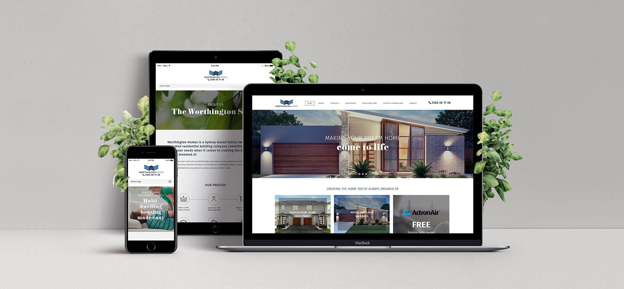
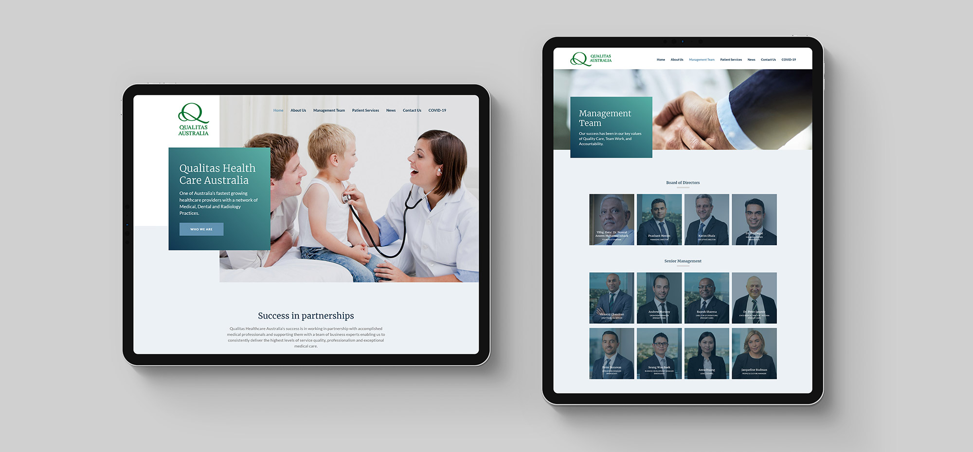
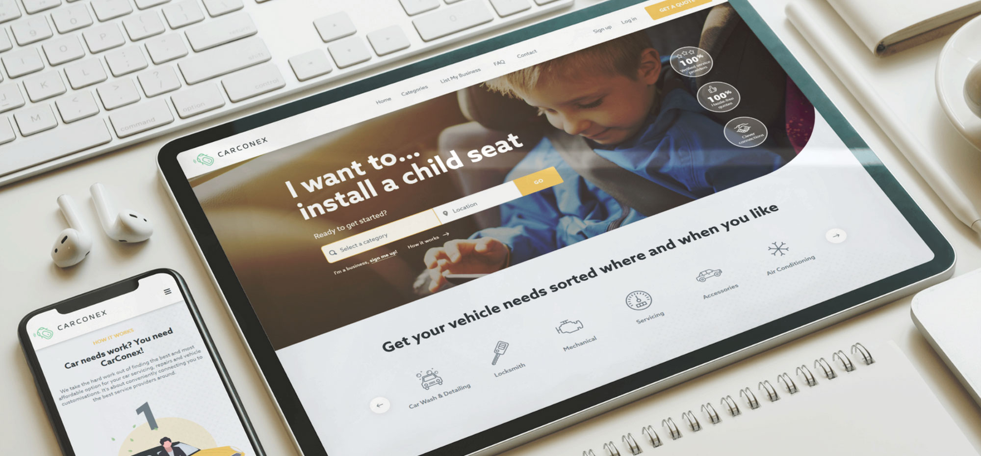
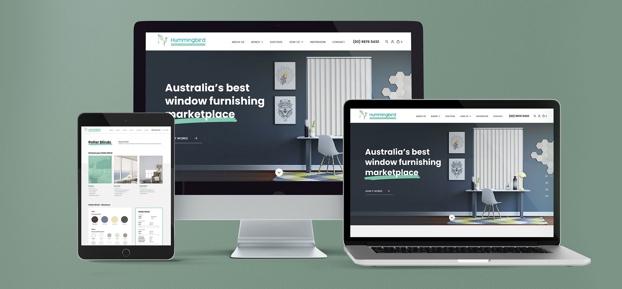
As you can see from the examples above of websites we’ve designed and built for three of our clients, our web developers have the know-how and expertise to vastly improve your website’s UX or even build you an entirely new site with UX as one of its main foundations. Click here to see more of our work and to learn more about our capabilities, and contact us today to see how we can help.


