As a self-confessed shopping addict, I’m constantly browsing through fashion blogs, websites and magazines oohing and aahing over the latest looks that strut down the runways and red carpets. I also spend plenty of time perusing different web design trends for both work and pleasure and love to see the latest and greatest trends that are so cleverly created.
So one day while I was devouring the latest issue of InStyle magazine it dawned on me… web design and fashion trends aren’t all that different! Here are four coinciding website design and fashion trends that have hit the scene this year.

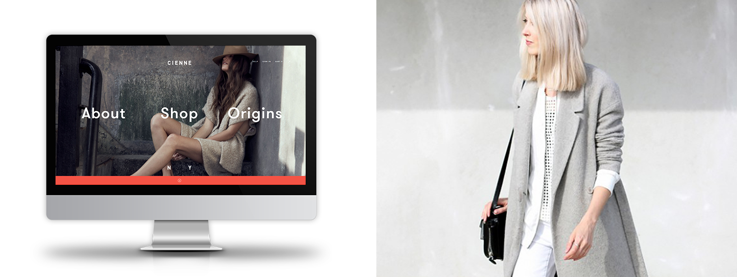
Clean & simple
The minimalist trend for both web design and fashion has been around for a while and it doesn’t look like it’s going anywhere soon. Websites that have a clean and simple look while still bursting with information can be compared to the fashion style of pairing basic pieces in muted tones to create a simple yet striking look.
Get a feel for the website here

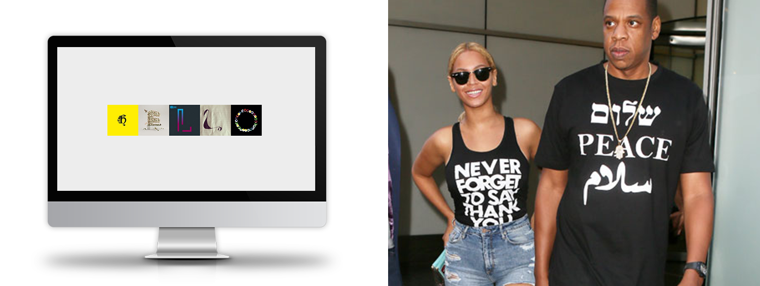
Large typography
If you want to get a message across – make it LARGE! Big and bold typography has a powerful and assertive effect in web design, especially when coupled with comparable images. The same goes for statement tees that convey messages and logos – a look that was popularised in the 80’s and has made a comeback in the last couple of years. In both of these cases, the text becomes a graphic element as well as content.
Take a closer look at the website here

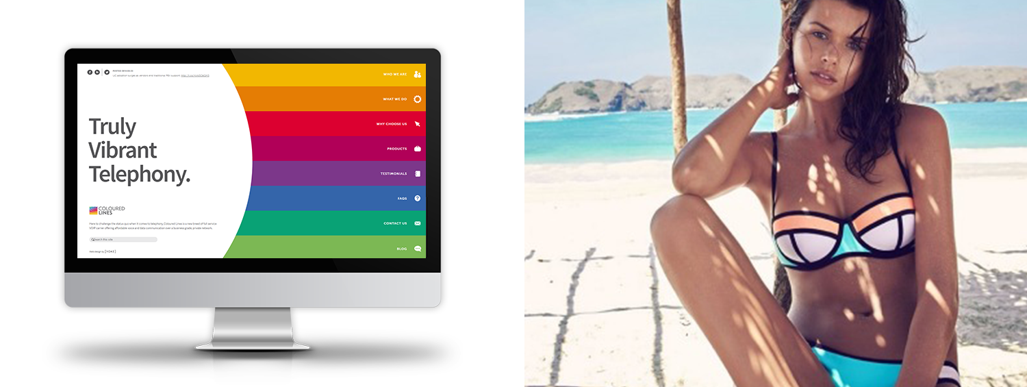
Colour-blocking
This trend is an oldie but a goodie for both web design and fashion. By dividing content into a grid and applying different colors, it creates a card-like mosaic making a website both visually pleasing and easy to navigate. This is a style that has been undeniably popular within the fashion sphere, as proven by Aussie swimwear brand Triangl. Their colour-blocked swimwear have been adding a simple, chic look to beaches all over the globe.
Check out the website here

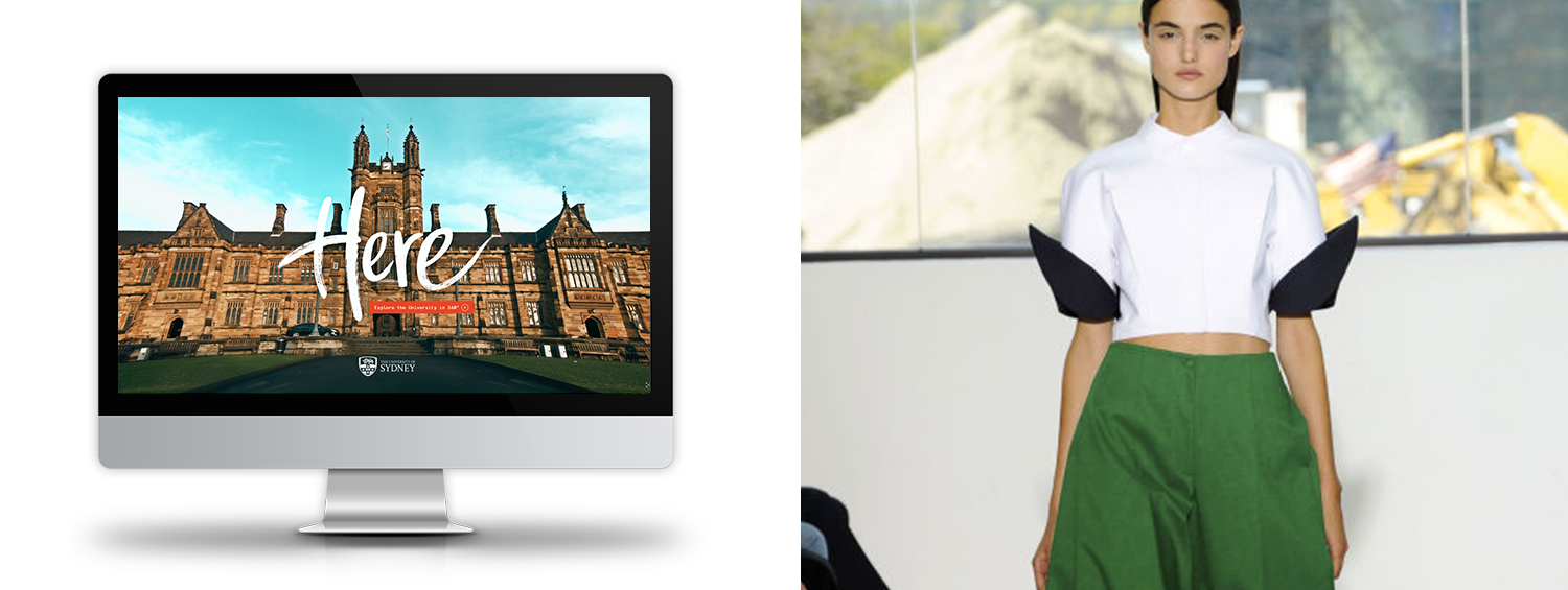
Cinematic experience
Aside from super-sized typography mentioned earlier, the larger-than-life trend also applies to images and navigation, such as hover effects and animations on scroll. Inspired by TV ads and movies, there’s a very cinematic vibe emerging in web design trends. The same dramatic effects were seen strutting down the catwalk at New York Fashion Week a couple months ago, with billowy skirts, big over-the-top sleeves and bold hues everywhere.
See the website in action here
Can you think of any other fashion and web design trends that are similar? We’d love to hear what you come up with.