Last month Instagram updated their branding and the internet had a virtual meltdown. The new look may have left you scratching your head, but there are a few reasons why the change was necessary.
The old logo
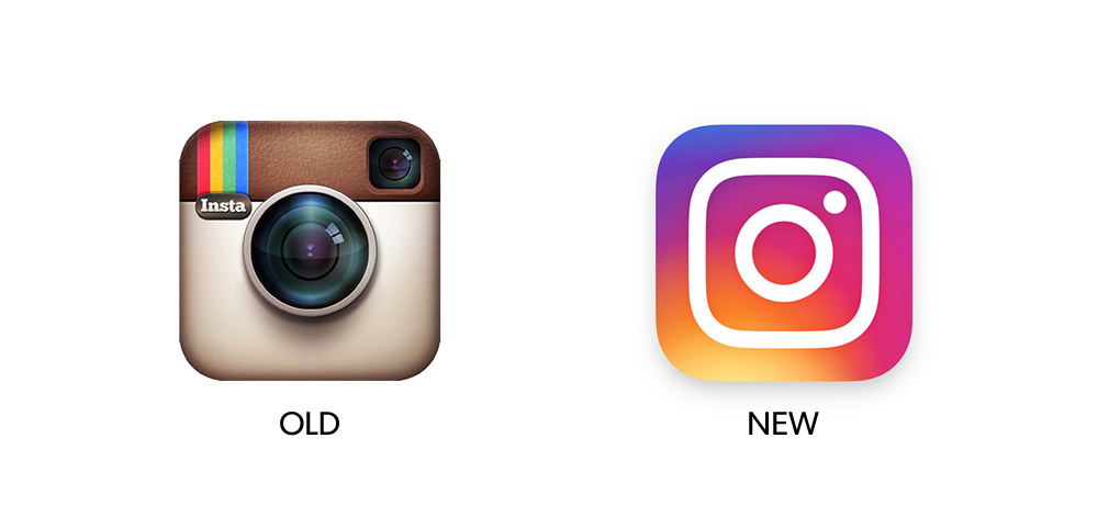
Instagram’s old logo had a retro, muted and textural design, reminiscent of a Polaroid camera. With a fun, nostalgic look and feel, the old logo effectively represented Instagram’s primary function at the time: an easy way to manipulate photos taken on an iPhone.
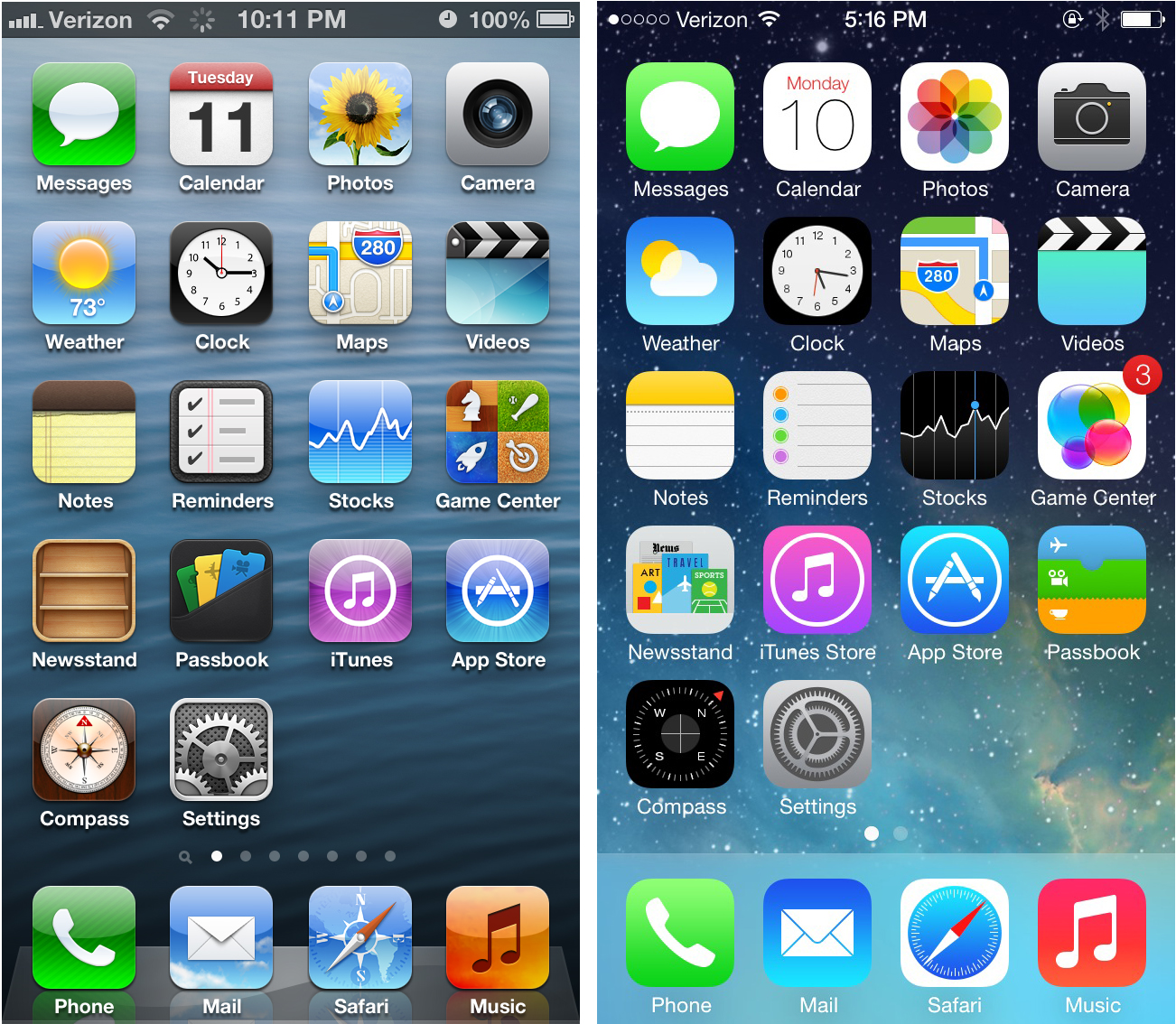
The design falls into an aesthetic called “skeuomorphism” which resembles real life textures and lighting. This style is something the creative world has since abandoned and Instagram were still dragging the chain. As Jony Ive from Apple explains, users are now completely comfortable with touch screens so there is no need to reference the physical world so literally.

In terms of its service offering, the branding didn’t fully represent the millions of photos and videos now shared by users everyday on both Apple and Android devices. It didn’t embody how five years from launch, the app has evolved to become a global community for sharing moments and inspiring creativity in all of its users along the way. In short, it no longer represented where the business is today and where it wants to go tomorrow.
Why rebrand?
A brand that looks dated or irrelevant is a business out of touch with its customer. That goes for your logo, website, product packaging, signage – everything. Your brand has to look the part and be reflective of your business today.
Five years on from launch, the platform has evolved to become a global community for sharing millions of photos and videos. All day, every day, Instagram users post filtered, polished pictures of pure perfection, all the while interacting and engaging with new trends, people and products.
It’s a goldmine for brand awareness – not to mention product placement – and key global brands have certainly used it to their advantage. From stunning in-situ shots shared directly from a company profile, to recruiting Instagram influencers for product endorsements and sponsorship deals.
The business had outgrown its ‘retro’, static, single-function branding, so a rebrand was necessary.
The new look logo
According to Instagram’s official blog, the new look logo was designed to reflect how vibrant and diverse Instagram’s community of storytellers have become. But we also believe the move away from skeuomorphism was a way for the brand to “fit in” and look relevant on Apple iOS. iOS ditched it some time ago and, surrounded by a flurry of bright, minimalistic icons, Instagram’s icon stood out for all the wrong reasons.
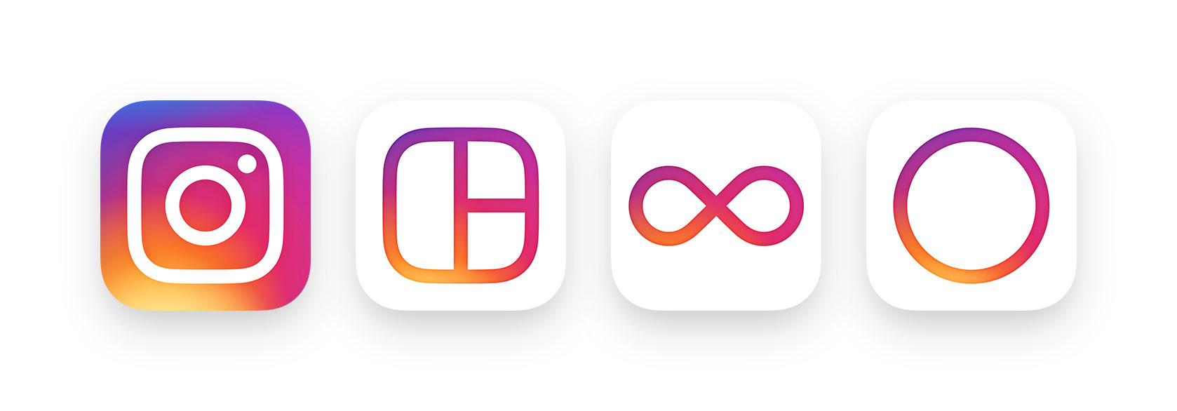
The new logo is now a flatter, more saturated design with a rainbow of pinks, oranges and purples in gradient form.

Instagram also updated its user interface to be simpler, with menus and background now entirely black and white. This not only makes it easier to navigate the app, but also adds a level of simple sophistication to the platform.
Summary
Whether or not you’re a fan of the new look, one thing’s for sure: the change certainly captured our attention. But most importantly, it has demonstrated Instagram’s determination to not get complacent. And a brand that is proactive, fresh and always a step ahead of the competition can only mean good things for the future of a business.
If you think it’s time to revamp your brand, talk to our team today.
