With the new financial year well and truly in full swing, there’s never been a better time to take a good hard look at your brand and decide whether you’re in need of a few tweaks or complete makeover in the design department. To help you figure it out, our all-knowing and brand-savvy designers have offered up a few tokens of useful advice on what to look out for when it comes to your logo, website and print.
Here are a few questions to ask yourself when reviewing whether or not your brand design is up to scratch.
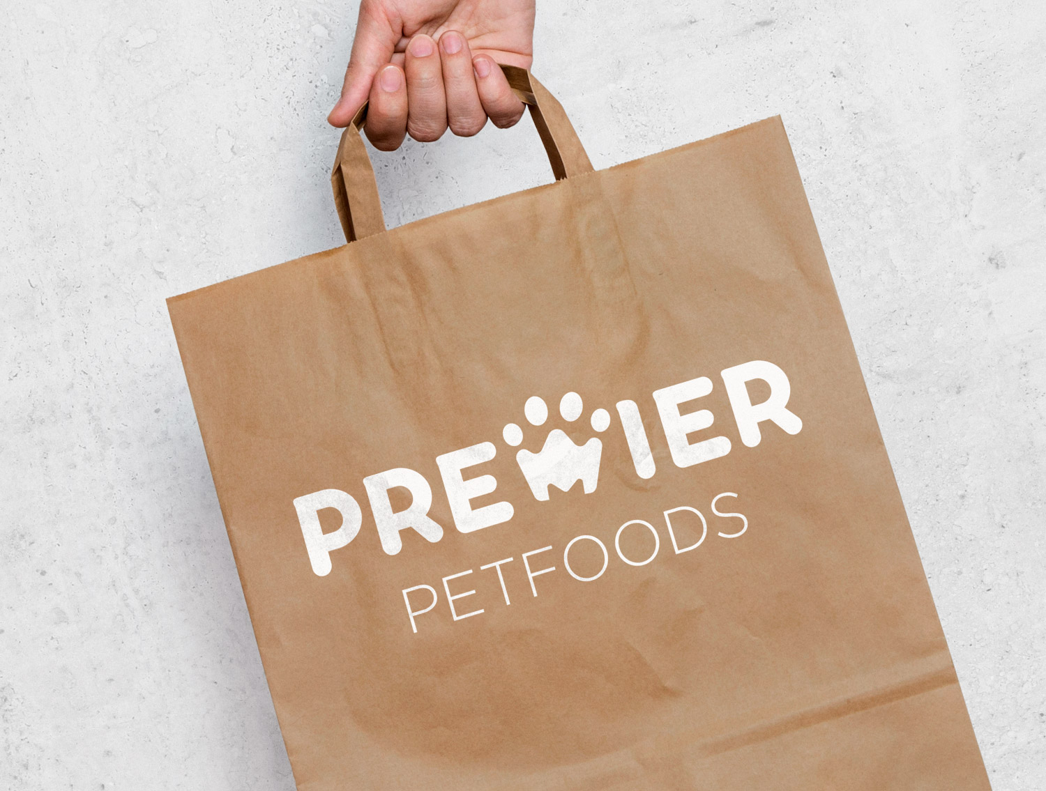
Do you love your logo?
Keep it simple
Dalal is all about simplicity when it comes to creating a logo that packs a punch, Like the Woolworths logo, which utilises a clean, simple design of combining ‘W’ and an apple to convey freshness. She can’t overstate how important it is to not over complicate your logo:
“I find there are two common mistakes when it comes to logos. Either the design is over complicated or a business is so set in their ways that they’re not willing to accept guidance in developing a new logo concept. It’s true that businesses know their business better than anyone else, but we know logos better than anyone else.”
Dalal Nizam (Digital Designer)
Make sure there’s meaning
Your logo is the face of your brand and often the first facet of your business that a potential client or customer is faced with. Jas can’t stress enough how important it is to make sure there’s a story behind your logo. In her opinion, the Fed Ex logo is on point, making clever use of negative space between the ‘E’ and ‘X’ that represents a small arrow to symbolise speed and accuracy.
“Having no meaning behind a logo will make a brand appear amateurish. A logo should be able to tell a story that’s clear, to the point and instant.”
Jasmine Ng (Senior Digital Designer)
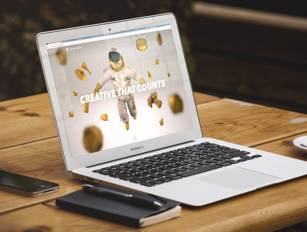
 Is your website an accurate reflection of your business?
The magic is in the imagery
Less is more when it comes to website content, and the focus should lie in the imagery to really make yourself and your services stand out. Janine offers some great advice on how to make your website stand out from the competition.
“Invest in decent-quality imagery that can be used across your brand between web and print. Stick to the point with your content – don’t waffle. Consider your audience – are they going to understand your industry jargon? Are you inadvertently talking to your competitors instead of your customers?”
Janine Warner (Senior Digital Designer)
Websites on the go
The most common red flag we see at Orion is a website that isn’t responsive (this means that it’s easily viewable across all devices). Viewing a website on a mobile phone now accounts for more than 50% of website traffic, so it’s critical that your site is easy to navigate and looks great on mobile devices.
“In 2015, Google started penalising sites that aren’t responsive, meaning that your rank will drop in comparison to your competitors whose sites are mobile-friendly. Since then they have boosted this algorithm, further penalising sites that are not responsive.”
Scott Roberts (Team Lead, Manager)
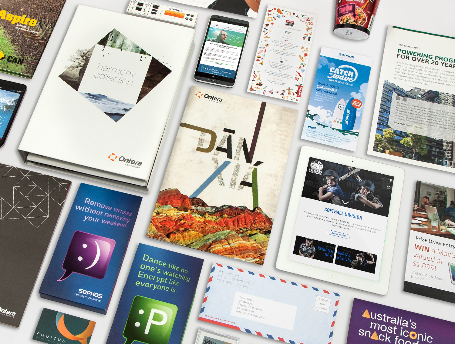
 Is your print collateral on point?
Small changes that make big statements
Investing in good quality print collateral is overlooked by many businesses who don’t see the value in going the extra mile. There are little things you can do to take your print from average to eye-catching, such as experimenting with paper stock, unique printing processes like foiling, Scodix or embossment and playing around with size and orientation. Whether you amp up your corporate brochure, business cards or catalogue, Sam is all for making sure your print collateral is making a statement:
“Digital marketing is by far more cost effective, and we have a lot more digital jobs coming through, but nothing beats a nicely printed capabilities brochure or a cool, quirky direct mailer that you can be proud of and your customers will be impressed by.”
Sam Leong (Team Lead, Design)
These are just a few of the features you need to consider when putting your brand through its paces. There’s plenty more you can do with your branding to make sure you appeal to your target audience and make your business stand out from your competition. Get in touch and we’ll help you start deconstructing your brand design.

 Is your website an accurate reflection of your business?
  Is your print collateral on point?