In this edition of In the Spotlight: A high quality, thorough set of brand guidelines for the Ingham Institute for Applied Medical Research is just what the doctor ordered, plus, a modern twist on the traditional lemonade stand with a fresh new logo and branding for the Citrus Factory. And don’t miss our special case study on the comprehensive project we completed for Austral’s new development – Rohan’s Run!
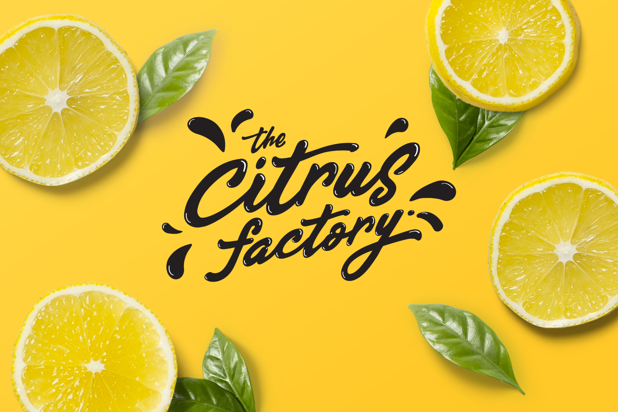
Freshly squeezed branding for the Citrus Factory
The Citrus Factory has been quenching festival-goers thirsts since 2003 and were well-and-truly ready to take their look and feel to the next level with fresh new branding. They turned to Orion Creative to refresh their logo and overall branding with a modern twist on the traditional lemonade stand.
Check out how we achieved great results for this project and keep an eye out for them out at music festivals and markets across Australia!
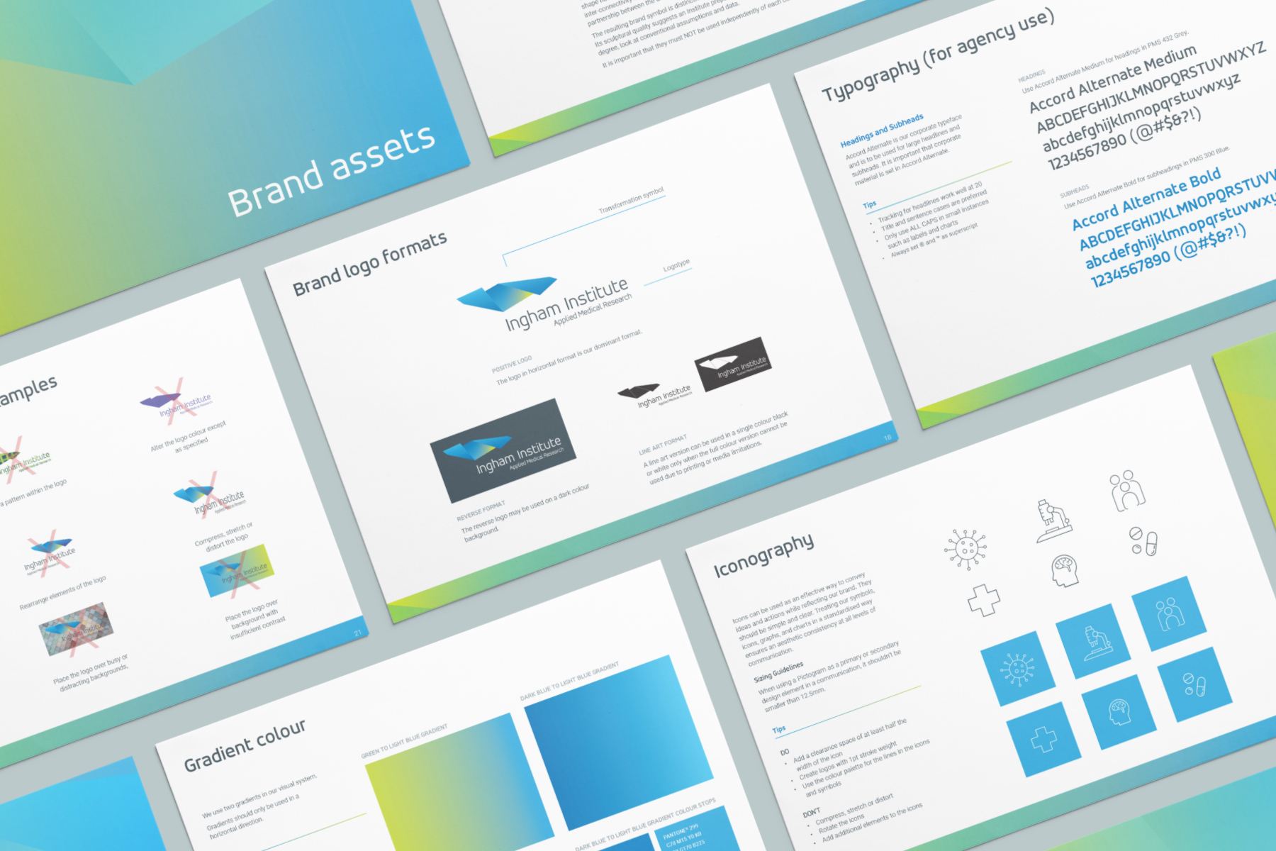
Protecting the integrity of a world-class institute
Having had the pleasure of working with the Ingham Institute on several projects in the past, Orion already had a fairly strong understanding of the institute’s personality and brand. Setting up their brand guidelines involved interweaving the institute’s values and vision into tangible guidelines. These guidelines would serve as a centralised reference point for logo use, typography, tone of voice and other elements that would ensure consistency across the board.
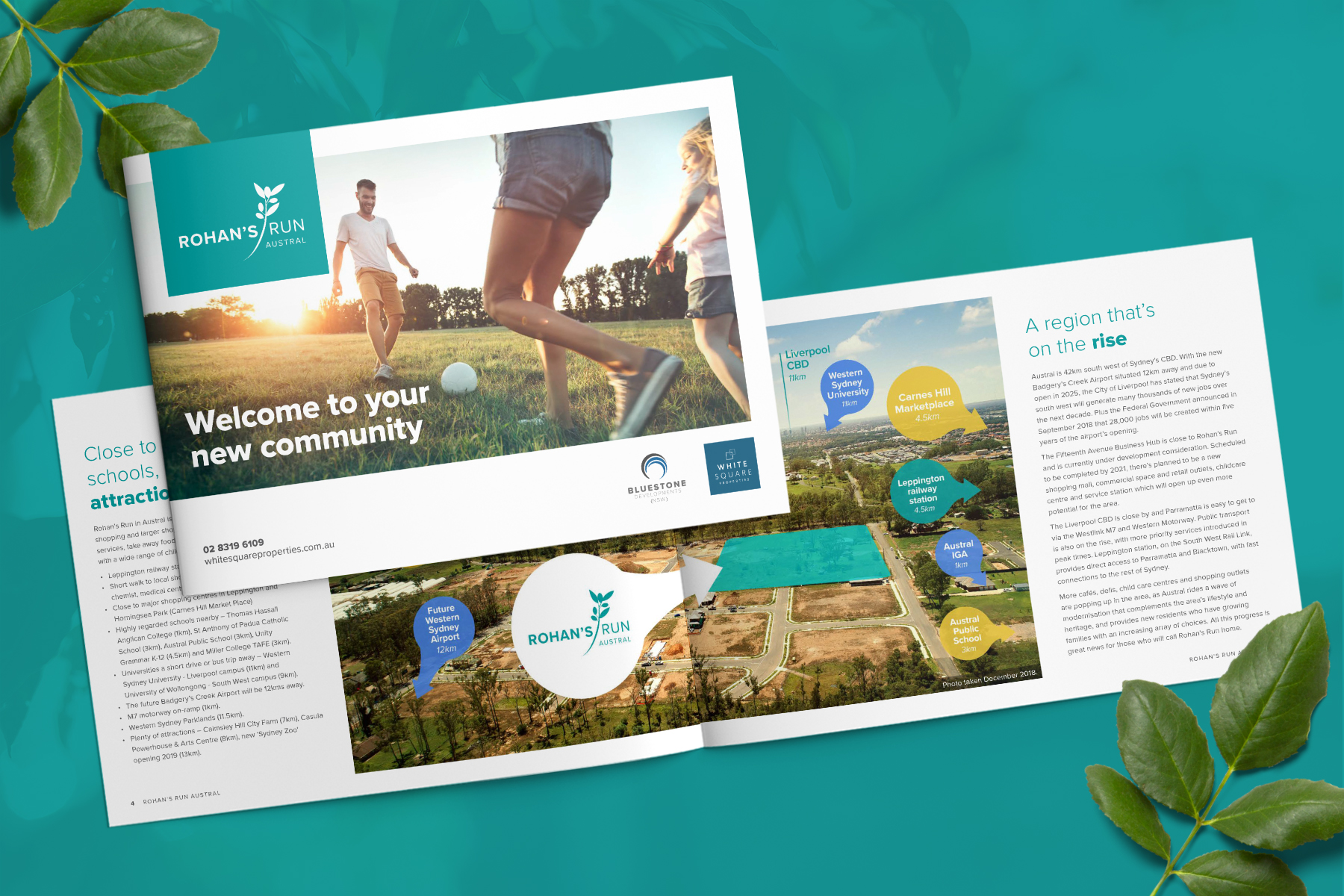
Rohan’s Run
RILOW Property Group has expanded from a single display home in Kellyville Ridge to a multi award-winning property solutions provider.
In the lead up to launching a new development in Sydney’s South West, Orion was engaged to provide a wide range of expertise. From content creation to video production… and lots in between, check out our Rohan’s Run case study.


