If you’ve ever worked with a design or marketing agency, you’ve probably heard some terms that sound like a foreign language. PMS? Vector? DPI? If you haven’t been to design school yourself, you may not know exactly what these terms mean – but understanding them will make projects run a whole lot smoother.
Here are five bits of design jargon you’re most likely to come across – and what they mean.
1. RGB, CMYK, PMS colours
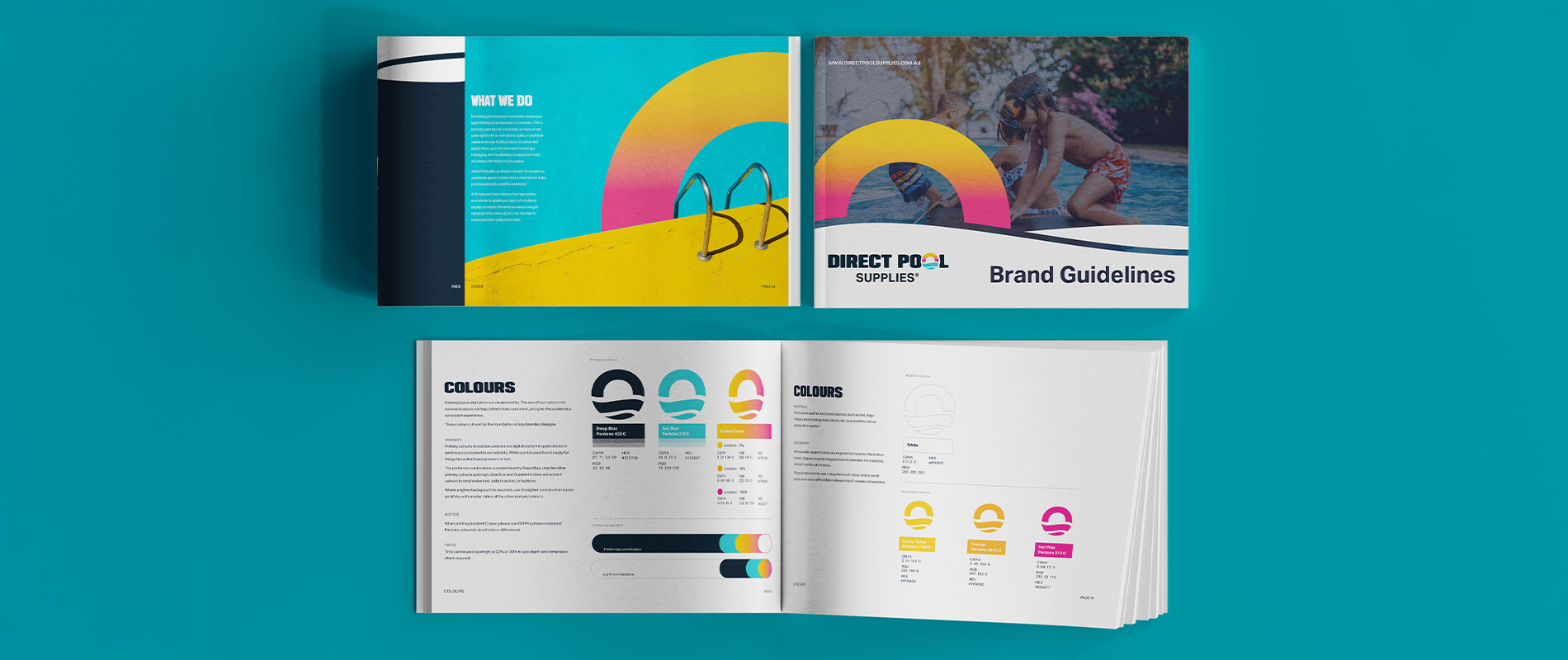
If you have brand guidelines, you’ll likely have encountered different colour codes and the acronyms RGB, CMYK, PMS. They can describe the same colour, but for different uses:
- RGB (which stands for “Red, Green, Blue”) is for screens.
Anything digital – e.g. websites, social media, presentations – uses this colour space. Screens create colour using light. Tiny red, green, and blue dots (pixels) glow at different intensities, and when combined, they produce every colour you see on your phone or computer.
- CMYK (“Cyan, Magenta, Yellow, Black”) is for print.
Instead of glowing pixels, printers layer dots of ink on paper. By overlapping and mixing these four inks in different amounts, they can create a wide range of colours. This is called four-colour process printing (or just “CMYK printing”). You can also do print runs that use more than four inks, but CMYK is the most common. A CMYK file will often look different on screen compared to in print, the colours may look completely wrong on screen.
- PMS (Pantone Matching System), sometimes called “spot colour,” is a standardised ink system.
Think of it like premixed paint – the idea is the colour should be the same every time, no matter which printer you use. PMS is great when you need absolute consistency for a single brand colour (like a logo), but it’s not practical if you need a whole range of colours, like in photos. Because each colour requires its own ink, PMS printing usually costs more than CMYK – unless you’re doing large print runs where the setup costs can be spread out.
The aim is to try and keep your brand colours looking consistent across different materials and outputs. A logo in CMYK can look vastly different on a screen, compared to when printed. It’s worth noting you’ll always see slight variations between different screens and different print materials.
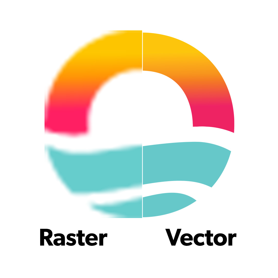
2. Vector vs Raster
A common question you may get asked is: “Do you have your logo in vector format?”
- Vector files (like .AI, .EPS, .SVG) are built from paths and points, so they can scale infinitely without losing quality. This means your logo will look razor sharp on a business card or a billboard. Vectors are best for logos, icons, and flat illustrations.
- Raster files (like .JPG, .PNG) are made of pixels. They look fine at their original size, but if you enlarge them too much, they’ll blur or pixelate. Photographs will always be raster, since they’re captured as pixels.
Sending us a small JPG logo for a pull-up banner won’t cut it – it’ll come out fuzzy. A vector logo means it will print out crystal clear.
Please note, a raster image can be saved into an .AI file, but that doesn’t mean it’s actually a vector. We can check for you.
3. DPI/PPI (resolution)
Resolution is about how much detail an image has. You may hear two terms thrown around:
- DPI (“dots per inch”): This is a print term. Printers generally need 300 DPI for a clean, professional result. We can confirm if the resolution is high enough. The important thing to remember is that print requires higher-resolution images than screen.
- PPI (“pixels per inch”): This is a digital term. Websites and digital graphics usually only need 72 PPI (though modern devices can handle higher).
If we ask you for a photo for a brochure, sending through a Facebook download probably won’t cut it – those images are usually too low-res. For print, we need the original high-resolution file straight from the photographer.
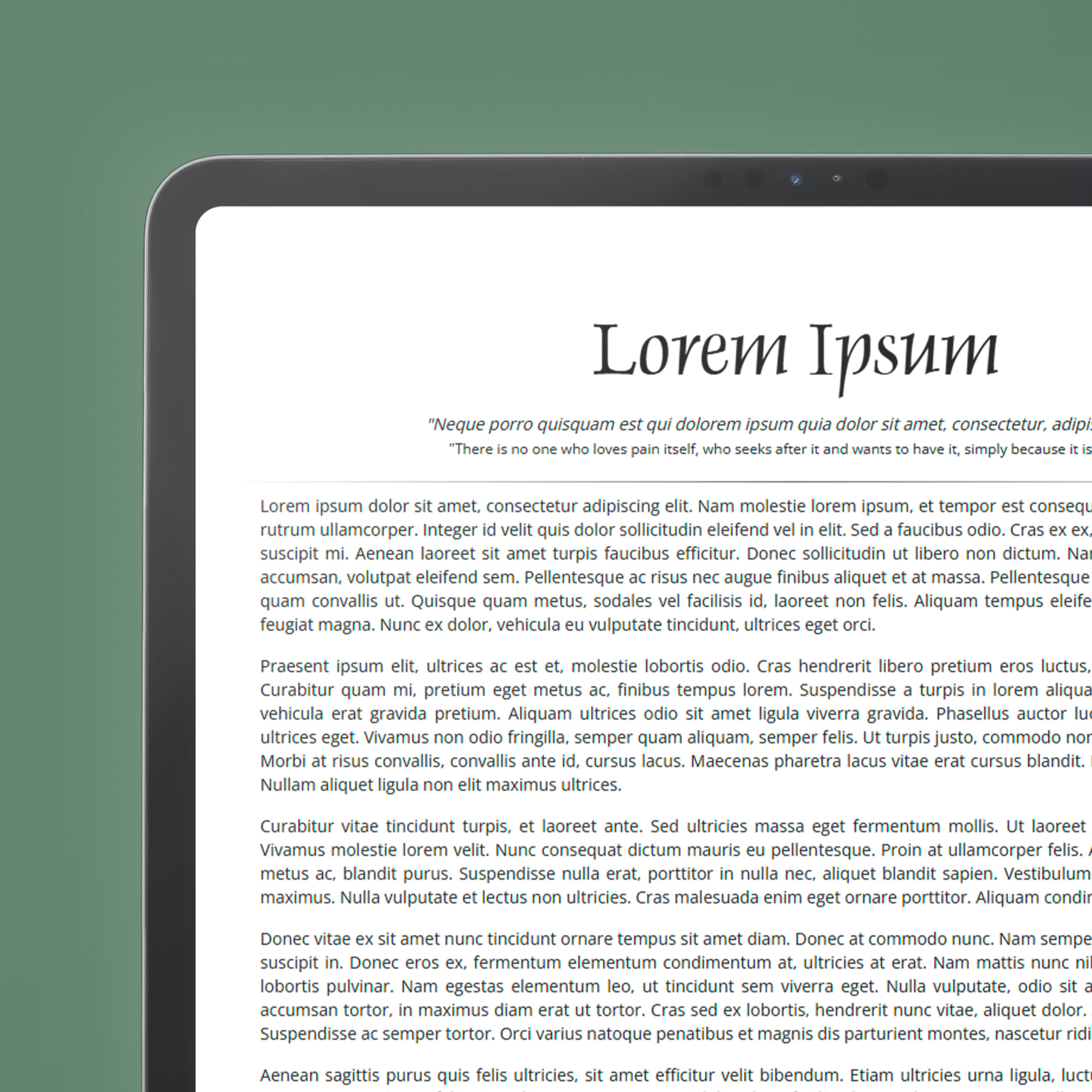
4. Lorem Ipsum
Ever opened a design concept and seen paragraphs of gibberish, which looks a bit like Latin? That’s Lorem Ipsum. It’s simply placeholder text designers use to show what the layout will look like before the final copy is written.
We’re not suggesting you publish your new brochure in Latin! It’s just a stand-in so you can focus on the design without being distracted by half-finished copy.
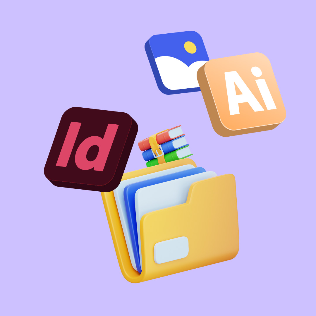
5. Packaged File
Sometimes an agency might say, “Can you send us the packaged file?” This means a folder that contains:
- The main design file (e.g. InDesign or Illustrator)
- All the linked images and graphics used in it
- The fonts required
A design file on its own usually won’t have everything you need. Without packaging the file, you might open the file later and see missing images or default fonts. A packaged file ensures everything stays intact, whether it’s going to print, another designer, or being saved for future use. In programs like professional design programs like InDesign and Illustrator, “packaging” is a specific process found in the menu (File > Package).
You don’t need to speak fluent design to work with an agency – but knowing these few terms will make the process smoother and keep your brand looking sharp. Next time you see RGB codes in your brand guidelines, Lorem Ipsum in a draft, or get asked for a packaged file, you’ll know exactly what’s going on. And if you’re ever confused by design jargon, please ask us – we’re always happy to explain!
Interested in finding out more?