A brief is like good stock.
It’s the clear, condensed, flavoursome base from which the most magnificent conceptual soups or sauces can be concocted.
Mouth watering? Let’s get cooking…
Why a good brief is the start of something delicious
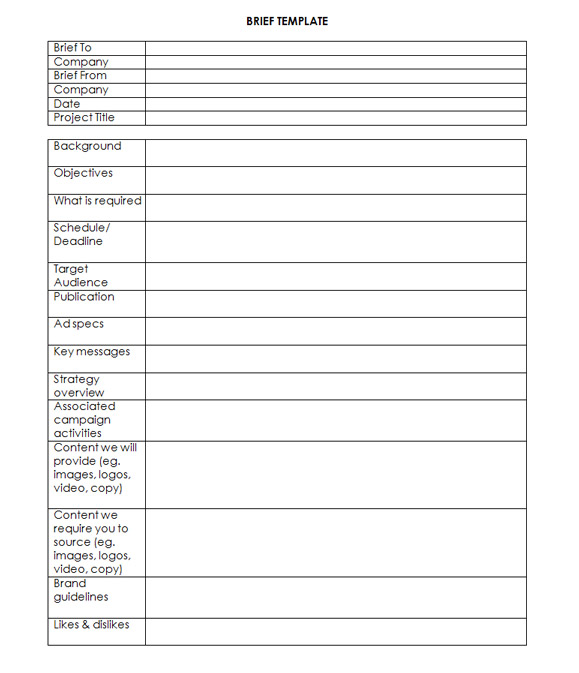
A brief is a document – sometimes presented as a table – that communicates to the designer or creative what it is that they need to concoct.
A brief will need to be adjusted according to the type of project; for example, if your company wants a new website, there’ll be a bunch of other related information we need to know about functionality.
This template would suit the requirements of an advertisement for a magazine.
Writing a brief is an essential step in a successful project; it defines the parameters in which a designer needs to work.
A good brief will:
Deliver exciting, on target design
When a creative team knows what’s needed and what’s expected, these form the boundaries of the sandbox in which the creative, problem solving designer’s mind can play.
Some clients think that giving a designer free run will result in the most inspired work. However this ignores the fact that designers are also problems solvers. Present them with the challenge in order to allow them to rise to it.
Completely open briefs may work in some situations – say when there is a strong history of a client and a designer working together – but even then, there are many variables on which success depends.
Another key is to give designers enough time to do it; a rushed job may provide an ok solution, but give them enough time and it’s more likely to be great!
Ensure consistency across campaigns
If the project is part of a larger campaign, it will help the designer, and improve the overall message, if the challenge is presented as part of the larger project.
Writing the brief also serves as an opportunity for different stakeholders within a company to ensure a common understanding of the result required. As we all know, our work colleagues can have a range of different preferences for styles. Developing a brief also serves a purpose in setting goalposts agreed by all. When this is not done, you can end up with one stakeholder preferring a ‘rustic’ themed concept while another is hell-bent on ‘modern’ for example. This needs to be established before designing begins.
Include examples of what you like
Designers are suckers for things like mood boards. If you can include images or links to sites which exemplify styles that your team likes, it gives us a head start. Likewise, mood words are useful. Bright and playful? Dark and mysterious?
Introduce your brand and audience
If you have brand or writing guidelines, it will help us familiarise ourselves with your business and your target audience.
If not, paint us a picture. Give us an overview of your services and products; your speciality; your niche.
Now, how about your audience. Men under 50 with a love of the great outdoors? Interior designers who are largely women between 22 and 40? We want to get to know them, too, and it helps to be able to imagine them as we tailor a message to them.
Key deets
What are the dimensions of the poster? How many seconds of airtime do you have? How many subscribers on your database or what do you need to showcase on your website?
Without these crucial bits of information it’s hard to give both an accurate quote or a workable solution. All of these critical tidbits are best included from the get-go. It’s no use coming along at the end and throwing an entire turnip into the pot.
Any substantial new elements added after later will incur costs, too – so it’s better for the client to understand all costs up front.
But don’t forget it is a brief – it’s not meant to be a weighty document. Dot points are fine, and keep it as clear and relevant to the task as possible. Avoid mixed messages or unnecessary complications which might muddy the waters or extinguish the passion.
Got any tips, preferences or peeves on the subject of writing briefs (or preparing stock)? Express yourself here.
